The users of the social networking and research site Are.na have a hard time explaining what exactly it is. You could call it “a collection of digital meta-theses” or “playlists, but for ideas.” Some say it’s what would happen “if the French created the internet,” or that it’s “like nerdy Pinterest.” But perhaps the best way to explain the website’s ethos? “Social media for people who dislike social media.”
The site, which was created in late 2012 by a group of artists and designers intent on creating a space that they could use to incubate ideas over time, has no advertising and no tracking. It has a feed, but there are no algorithms dictating what you see or when. It is a digital space to collect images, text, links, and documents, but what you collect on the site isn’t about popularity: There are no “like” buttons. That’s because it was created by designers and artists who are attuned to good, ethical design, making it something of an anti-Facebook social network by creatives, for creatives who want a space online in which to think, gather their ideas together, and share them with others.

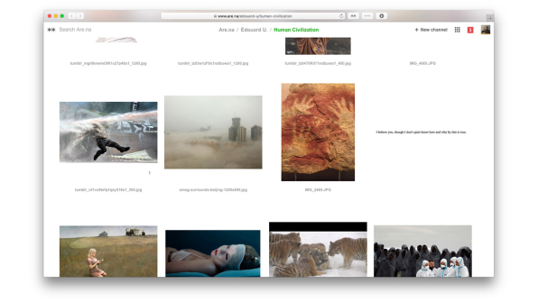
This difficulty in describing exactly what Are.na is has become part of its allure–“blocks” of content reside within folders called “channels,” and can be connected to as many channels as users want, creating a network of images, links, and text. On the site, there are even channels for crowdsourced descriptions of how to describe Are.na at a party and a channel for all the different ways in which people use it. For instance, one user keeps channels as reading lists, playlists, and as a portfolio for his work.

The platform’s lack of a simple explanation is perfectly suited to an era when more people want something different out of the internet. In the groundswell of anger and suspicion toward social media platforms like Facebook and Twitter for spreading misinformation, amplifying harassment, and stamping out nuance, Are.na feels like a necessary antidote–a calm white space where you can group your ideas, whatever their form or complexity. And while the site’s user base of 21,000 registered users and 7,000 active monthly users is minuscule compared to the social media giants, it is growing rapidly at 20% month over month.
“What does it feel like to connect to the information you’re consuming and feel like you’re building new thought in the same way that you would in a really good conversation with a friend or reading a good book, one of those human things that expand our brains?” says Charles Broskoski, Are.na’s cofounder. That, in essence, is Are.na’s goal: to make it easier for that kind of intelligent connection to happen online, replacing the passive consumption that manifests in hours spent mindlessly scrolling and “liking.”
As Broskoski put it, “[Are.na] is less like a casino and more like a nice library.”

No Ads, No Algorithms
On first glance, Are.na’s sparse website feels a little bit like Pinterest, except you can add more than photos. But for Broskoski, there are some fundamental differences: Pinterest focuses mostly on images, primarily of things that you can buy. It’s trying to sell advertising, while Are.na is not. Are.na’s freemium business model is central to the company’s ethos. You can sign up for Are.na for free and start creating blocks of content and folder-like channels, as long as they’re publicly available. But if you start to create larger private channels–which indicates to the Are.na team that you’re using the platform for bigger personal or professional projects–then the platform costs $5 per month, or $45 for the year.
“We think the business model is a fundamental thing that forms the user experience,” says Chris Barley, a cofounder and designer at Are.na with a background in architecture. “If we’re trying to have our users look at ads, that’s a different desire than giving them a space to work intellectually.”
Because the company isn’t trying to keep eyeballs on the site so it can sell more ads, the underlying mind-set is simply different. “We’re trying to set up this situation where we’re motivated to make people like the platform enough to pay for it,” says Broskoski.
Many social media companies that rely on ad revenue preach connectivity, positioning their service as the means to overcome the vast differences of time and space to share ideas and create a global community. This rings false, of course. These companies are motivated to connect you with friends and strangers because they can convert your attention into dollars. That’s part of what’s driving the backlash against Facebook and Twitter. “There’s a fundamental disconnect there,” Broskoski says. “We’re trying to make a company where that is actually the goal. We’re trying to build a normal business. If it’s useful enough then people will pay for it.”
The commercialization of the internet–partially to blame for the disconnect between the techno-utopian ideals of its earliest creators and its current state of affairs–was the reason the team created Are.na in 2012. Broskoski explains that in the early aughts, he and many of his friends were partial to an internet bookmarking site called Delicious, but when Delicious was bought by Yahoo in 2005, they decided they needed to create a tool of their own that wasn’t owned by a giant corporation–and Are.na was born. “Because we were artists and working on the internet, a lot of our practice had to do with searching out weird idiosyncratic things and going down the path of what we were interested in and then tying that to a thesis for a work,” Broskoski says. “The thing we wanted to do was collect all the resources we found in the world that felt important to us at a time and have a way to gather all that stuff into one place.”
At first, the site was mostly for Broskoski and a group of friends with similar mentalities. That was five years ago. Today, as paranoia about algorithms, data, and digital privacy rises amongst users of major social networking sites, Are.na might stand a chance with the rest of the world. “The cultural awareness of what people want out of the internet is changing and growing,” Barley says. “In other industries or areas that are not digital, health and wellness is a huge concern. But figuring out what that might mean in our digital lives is a more and more important space.”
Are.na’s designers have felt this disconnect online for many years, long before the 2016 election shook many people awake. “Designers and artists are those early-adopter types, and they’re more sensitive to how things get presented to them on the internet,” says Are.na cofounder and designer Chris Sherron. “They felt it as soon as Facebook introduced the like button. As soon as people started trolling on Twitter, they felt it.”

Trusting Users To Figure It Out For Themselves
As a designer-first site, Are.na’s web design is serenely white. It’s a bit confusing at first (in part, because there are so many ways you can use it), but when you try your hand at creating blocks and channels it quickly becomes intuitive. “I think a lot of current social networks don’t put enough trust in the user to think for themselves and in a way they overdo it in terms of the style, the colors, the language–you notice a lot of sites that use this real jokey and playful language,” Sherron says. “I think designers and artists who are the early adopters of the internet and the ones that set the trends–they’re seeing this and thinking, it doesn’t feel quite right. We want to make sure that we’re not taking people’s intelligence for granted and doing just enough.”
The challenges of the site–both the difficulty describing it and the vast number of ways you can use it–is also by design. “Part of the reason [Are.na] takes a little longer for people to get into is that it asks a little bit more of a user than something like Facebook,” Barley says. “The like button is the most mindless thing you could possibly do. What you do on Are.na is connecting, and it takes a lot more brain power. You’re marginally smarter for doing it and you build that muscle over a period of time.”

The company has found that a key draw for many users is the ability to work in small groups on the site–making it part social media and part productivity tool. Barley describes using Are.na for research, where three to five people collect and group information thematically into channels for everyone to reference. He joined the team about six months ago because he’d been using Are.na in a previous job. “It lets you have a thought over a long period of time and discover things slowly, rather than quick inspiration,” Barley says.
The platform has found a home in the classroom at universities like MIT, Yale, RISD, Parsons, Pratt, and Columbia, where professors and students have embraced it. Outside institutions are also using Are.na: The Chicago Architecture Biennial embeds content from the site on its blog, and the Guggenheim has built an entire interactive exhibition using Are.na as the content management system. And creative people who work at companies like Apple, Google, Tumblr, and Dropbox also use the service–which likely spills over into their professional work lives. Broskoski says that a recent user survey showed that 80% of people used Are.na in both personal and professional contexts. “It’s people who value intelligence throughout their day, both when by themselves and at work,” Barley says.
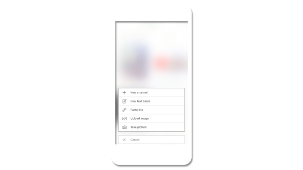
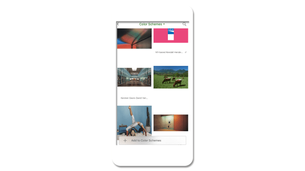
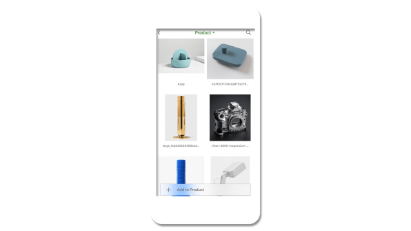
In 2016, the team built a bookmarking tool called Pilgrim that’s available for anyone to use, with Are.na as its backbone. At the end of 2017, they launched an iPhone app, a big step forward toward helping the platform grow and a common request from current users. And as the site enters its sixth year, its creators are hoping to double down on how Are.na can be used in team settings–something they’re already intimate with, given that they also use the platform for internal projects. What would Are.na look like if used in a larger context, like in a big corporation? “Those implications are really interesting if you think about entire companies slowly building ideas together over time, versus what they do now–these siloed brainstorm sessions that they push out on people,” Barley says. But even as they grow, the Are.na team is focused on their core user–which is, in essence, themselves.
“Making things that give dopamine hits for nothing is not what we’re trying to do. It’s usually in the service of thinking better and thinking with other people,” Barley says. In other words, they’re going to keep creating an ethically minded internet platform that puts its money where its mouth is. “Ethical might be one word,” he adds. “It’s our best guess about what we think people actually want now, and more of what people will want from the future.”
from Sidebar https://sidebar.io/out?url=https%3A%2F%2Fwww.fastcodesign.com%2F90157216%2Fthis-is-what-a-designer-led-social-networking-site-looks-like
