Our modern front-end workflow has matured over time to include design systems and component libraries that help us stay organized, improve workflows, and simplify maintenance. These systems, when executed well, ensure proper documentation of the code available and enable our systems to scale with reduced communication conflicts.
But while most of these systems take a critical stance on fonts, colors, and general building blocks, their treatment of animation remains disorganized and ad-hoc. Let’s leverage existing structures and workflows to reduce friction when it comes to animation and create cohesive and performant user experiences.
Understand the importance of animation
Part of the reason we treat animation like a second-class citizen is that we don’t really consider its power. When users are scanning a website (or any environment or photo), they are attempting to build a spatial map of their surroundings. During this process, nothing quite commands attention like something in motion.
We are biologically trained to notice motion: evolutionarily speaking, our survival depends on it. For this reason, animation when done well can guide your users. It can aid and reinforce these maps, and give us a sense that we understand the UX more deeply. We retrieve information and put it back where it came from instead of something popping in and out of place.
“Where did that menu go? Oh it’s in there.”
For a deeper dive into how animation can connect disparate states, I wrote about the Importance of Context-Shifting in UX Patterns for CSS-Tricks.

Animation also aids in perceived performance. Viget conducted a study where they measured user engagement with a standard loading GIF versus a custom animation. Customers were willing to wait almost twice as long for the custom loader, even though it wasn’t anything very fancy or crazy. Just by showing their users that they cared about them, they stuck around, and the bounce rates dropped.
This also works for form submission. Giving your personal information over to an online process like a static form can be a bit harrowing. It becomes more harrowing without animation used as a signal that something is happening, and that some process is completing. That same animation can also entertain users and make them feel as though the wait isn’t as long.
Eli Fitch gave a talk at CSS Dev Conf called: “Perceived Performance: The Only Kind That Really Matters”, which is one of my favorite talk titles of all time. In it, he discussed how we tend to measure things like timelines and network requests because they are more quantifiable–and therefore easier to measure–but that measuring how a user feels when visiting the site is more important and worth the time and attention.
In his talk, he states “Humans over-estimate passive waits by 36%, per Richard Larson of MIT”. This means that if you’re not using animation to speed up how fast the wait time of a form submission loads, users are perceiving it to be much slower than the dev tools timeline is recording.
Reign it in
Unlike fonts, colors, and so on, we tend to add animation in as a last step, which leads to disorganized implementations that lack overall cohesion. If you asked a designer or developer if they would create a mockup or build a UI without knowing the fonts they were working with, they would dislike the idea. Not knowing the building blocks they’re working with means that the design can fall apart or the development can break with something so fundamental left out at the start. Good animation works the same way.
The first step in reigning in your use of animation is to perform an animation audit. Look at all the places you are using animation on your site, or the places you aren’t using animation but probably should. (Hint: perceived performance of a loader on a form submission can dramatically change your bounce rates.)
Not sure how to perform a good audit? Val Head has a great chapter on it in her book, Designing Interface Animations, which has of buckets of research and great ideas.
Even some beautiful component libraries that have animation in the docs make this mistake. You don’t need every kind of animation, just like you don’t need every kind of font. This bloats our code. Ask yourself questions like: do you really need a flip 180 degree animation? I can’t even conceive of a place on a typical UI where that would be useful, yet most component libraries that I’ve seen have a mixin that does just this.
Which leads to…
Have an opinion
Many people are confused about Material Design. They think that Material Design is Motion Design, mostly because they’ve never seen anyone take a stance on animation before and document these opinions well. But every time you use Material Design as your motion design language, people look at your site and think GOOGLE. Now that’s good branding.
By using Google’s motion design language and not your own, you’re losing out on a chance to be memorable on your own website.
What does having an opinion on motion look like in practice? It could mean you’ve decided that you never flip things. It could mean that your eases are always going to glide. In that instance, you would put your efforts towards finding an ease that looks “gliding” and pulling out any transform: scaleX(-1) animation you find on your site. Across teams, everyone knows not to spend time mocking up flipping animation (even if they’re working on an entirely different codebase), and to instead work on something that feels like it glides. You save time and don’t have to communicate again and again to make things feel cohesive.
Create good developer resources
Sometimes people don’t incorporate animation into a design system because they aren’t sure how, beyond the base hover states. All animation properties can be broken into interchangeable pieces. This allows developers and designers alike to mix and match and iterate quickly, while still staying in the correct language. Here are some recommendations (with code and a demo to follow):
Create timing units, similar to h1, h2, h3. In a system I worked on recently, I called these t1, t2, t3. T1 would be reserved for longer pieces, down to t5 which is a bit like h5 in that it’s the default (usually around .25 seconds or thereabouts).
Keep animation easings for entrance, exit, entrance emphasis and exit emphasis that people can commonly refer to. This, and the animation-fill-mode, are likely to be the only two properties that can be reused for the entrance and exit of the animation.
Use the animation-name property to define the keyframes for the animation itself. I would recommend starting with 5 or 6 before making a slew of them, and see if you need more. Writing 30 different animations might seem like a nice resource, but just like your color palette having too many can unnecessarily bulk up your codebase, and keep it from feeling cohesive. Think critically about what you need here.
The example above is pared-down, but you can see how in a robust system, having pieces that are interchangeable cached across the whole system would save time for iterations and prototyping, not to mention make it easy to make adjustments for different feeling movement on the same animation easily.
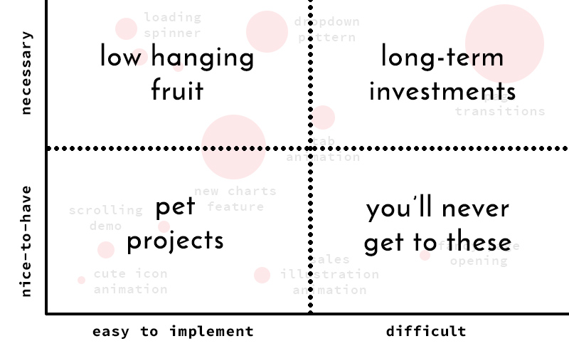
One low hanging fruit might be a loader that leads to a success dialog. On a big site, you might have that pattern many times, so writing up a component that does only that helps you move faster while also allowing you to really zoom in and focus on that pattern. You avoid throwing something together at the last minute, or using a GIF, which are really heavy and mushy on retina. You can make singular pieces that look really refined and are reusable.
React and Vue Implementations are great for reusable components, as you can create a building block with a common animation pattern, and once created, it can be a resource for all. Remember to take advantage of things like props to allow for timing and easing adjustments like we have in the previous example!
Responsive
At the very least we should ensure that interaction also works well on mobile, but if we’d like to create interactions that take advantage of all of the gestures mobile has to offer, we can use libraries like zingtouch or hammer to work with swipe or multiple finger detection. With a bit of work, these can all be created through native detection as well.
Responsive web pages can specify initial-scale=1.0 in the meta tag so that the device is not waiting the required 300ms on the secondary tap before calling action. Interaction for touch events must either start from a larger touch-target (40px × 40px or greater) or use @media(pointer:coarse) as support allows.
Buy-in
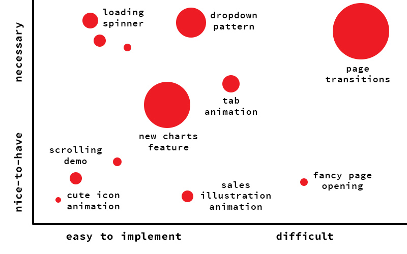
Sometimes people don’t create animation resources simply because it gets deprioritized. But design systems were also something we once had to fight for, too. This year at CSS Dev Conf, Rachel Nabors demonstrated how to plot out animation wants vs. needs on a graph (reproduced with her permission) to help prioritize them:


This helps people you’re working with figure out the relative necessity and workload of the addition of these animations and think more critically about it. You’re also more likely to get something through if you’re proving that what you’re making is needed and can be reused.
Good compromises can be made this way: “we’re not going to go all out and create an animated ‘About Us’ page like you wanted, but I suppose we can let our users know their contact email went through with a small progress and success notification.”
Successfully pushing smaller projects through helps build trust with your team, and lets them see what this type of collaboration can look like. This builds up the type of relationship necessary to push through projects that are more involved. It can’t be overstressed that good communication is key.
Get started!
With these tools and good communication, we can make our codebases more efficient, performant, and feel better for our users. We can enhance the user experience on our sites, and create great resources for our teams to allow them to move more quickly while innovating beautifully.
from 24ways.org https://24ways.org/2016/animation-in-design-systems/
