
We’re going to explore our top 8 mobile app design concepts to give you some design inspiration for your next project.
Are you still using vector-based tools for mobile app design? Step into the future of UX design with UXPin’s advanced code-based design tool. Sign up for a free trial to experience how one tool can revolutionize your product design workflows.
Top 8 Mobile App Design Examples
1. Bananas App
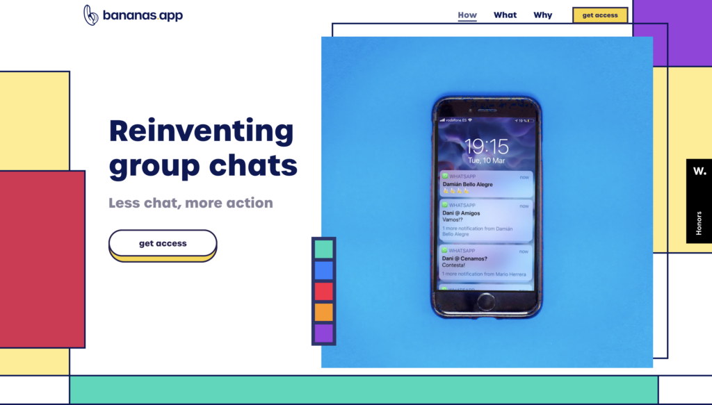
Are you looking for less talk and more action? Bananas App is “reinventing group chats” with a swipe or pick idea-sharing concept for friends.
The goal? To turn endless group chats into actionable activities friends can enjoy together–like going for a drink, playing frisbee in the park, or going on a spontaneous road trip. When you swipe right, you enter a chat group where those attending can discuss details like times, where to meet, carpooling, etc.
The Bananas App’s designers went with an 80s retro user interface design with bold typography and exciting colors, aligning with the product’s fun concept. The app’s use of energetic microinteractions and animations creates an immersive user experience that’s fun and engaging. The minimalist, intuitive layout makes it easy for users to add a new activity with just a few clicks.
The Bananas App is a fantastic example of how designers can create a balance between technology and real-world engagement.
2. Zero
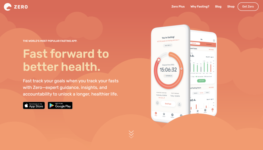
Zero is an app designed to track your fasting habits with advice and coaching from medical experts. Get insights on health markers like weight, resting heart rate, and sleep to see how they evolve with your fasting practice. There’s also a journal where you can use emojis to quickly tell the app how you feel during fasting.
Zero’s designers have done a fantastic job maintaining a minimalist UI while presenting an abundance of content with detailed insights and analytics. The app uses a vibrant green and orange color scheme to draw users to important call to action buttons and information.
The primary footer navigation provides users with four links to the app’s core features, making it easy to quickly find what you’re looking for. The app has over 345k reviews on the iOS App Store, with an average score of 4.8, showing how much people love the product and user experience.
3. Wealthsimple
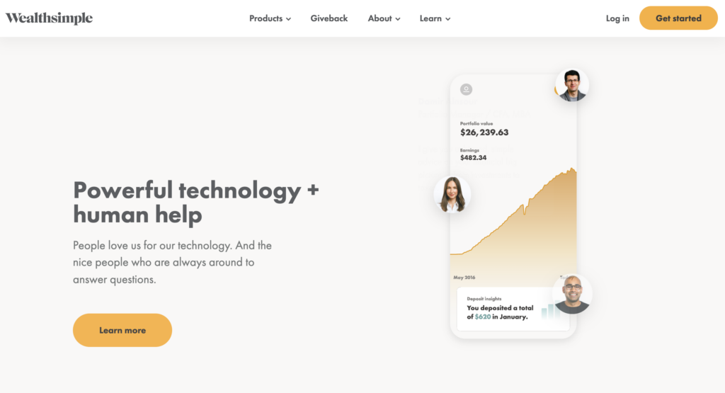
Wealthsimple offers users a way to manage their wealth based on risk and investment goals. Weathsimple takes the hassle out of learning about stocks and diversification by recommending a portfolio to invest in your future.
Because this is a financial services app, Wealthsimple needs a lot more personal information than regular apps. Designers have done an excellent job carefully breaking up the onboarding flow to avoid cognitive overload and keep users engaged.
Waelthsimple’s intuitive mobile app UI design is easy to navigate and displays only the information necessary to view your portfolio or add funds to your investment account.
4. Sleepist
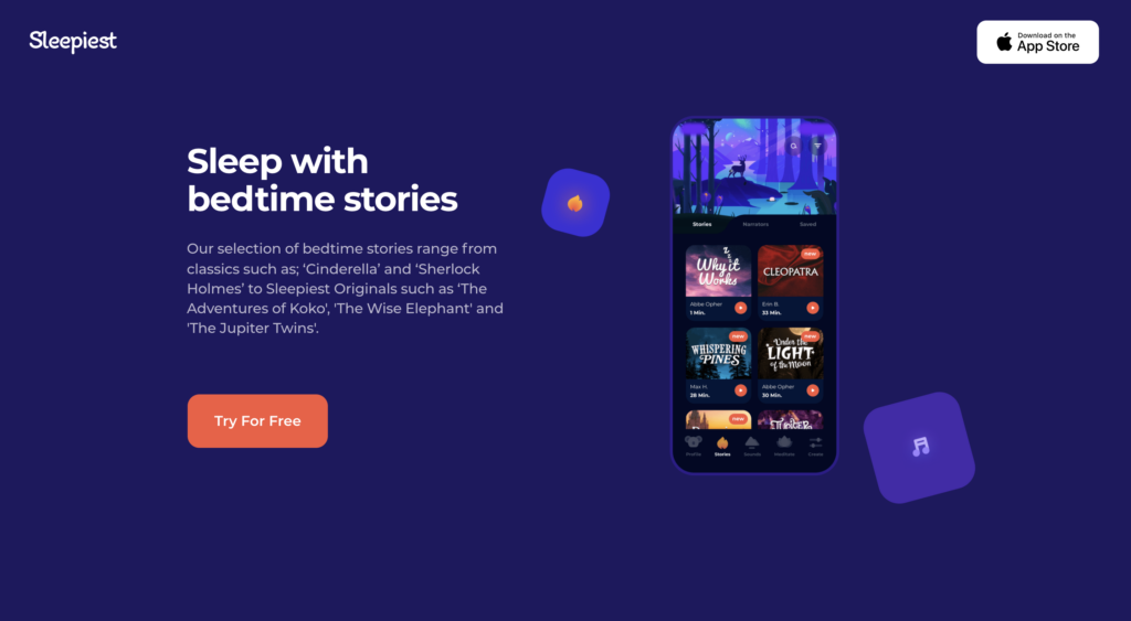
People who have Insomnia will love Sleepist, a meditation and sleep app designed to help you fall asleep! Choose from bedtime stories, sleeping soundtracks, or bedtime meditations to help relax you for a better night’s rest.
Designers have gone with a dark theme UI design to minimize the blue light impact, which adversely affects sleep. Bright orange CTAs allow users to quickly find what they’re looking for to reduce screentime. Users can also set a timer for the app to set everything for the night and not have to look at their phone again before drifting off.
5. Tumblr
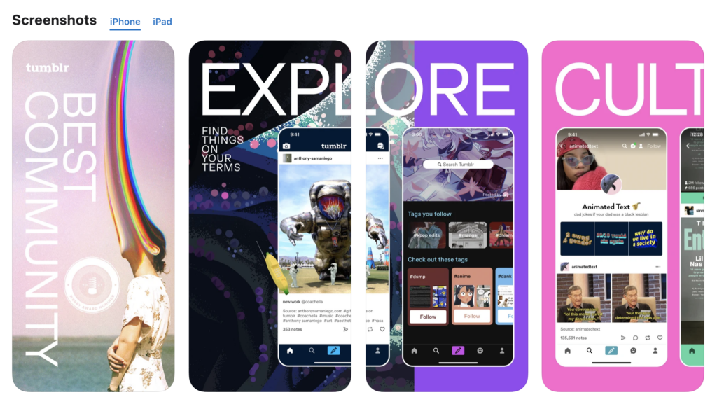
Tumblr is one of the world’s biggest social media platforms popular with youth and students. It’s a fantastic platform to discover art and pop culture trends among young people, where you’ll find some of the internet’s best memes and GIFs.
Tumblr’s designers have designed a mobile app experience that mirrors the platform’s content and community. They’ve created a fun and immersive user experience with a vibrant color palette, intuitive buttons, and simple navigation.
6. Alive by Whitney Simmons
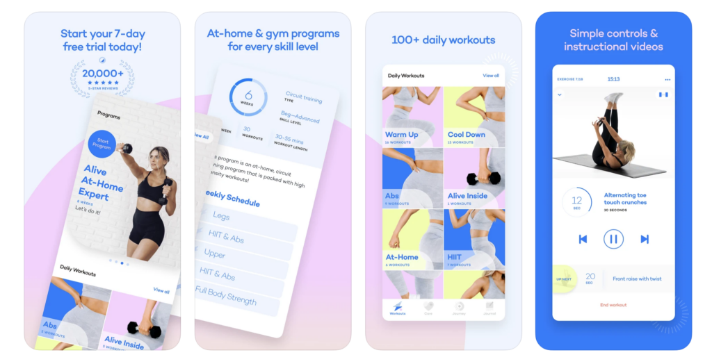
Alive by Whitney Simmons is a home wellness and fitness app to help women achieve their health goals. The goal was to make health and fitness easy and accessible, so busy women can form the habit effortlessly.
Designers have done well to mirror that concept with a simple and intuitive UI that makes it easy to find their desired workout. The soft color palette and minimal layout allow users to focus on the product’s content rather than getting sidetracked by unnecessary features and design elements.
Alive by Whitney Simmons has over 18k reviews on the iOS App Store with a 4.9 out of 5, showing just how much users appreciate the product and content. The Webby Awards recognized the app as a 2021 honoree for Best User Interface.
7. Evernote
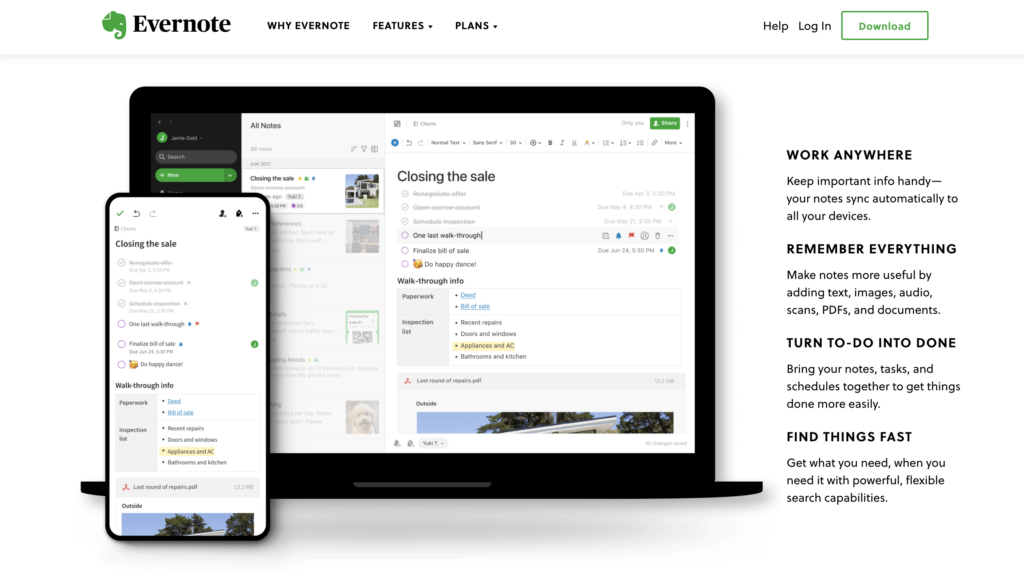
Evernote is the world’s biggest note and productivity platform, with hundreds of millions of users globally. The company has successfully simplified capturing, categorizing, storing, and sharing notes to maximize productivity.
Apple lists Evernote as one of its “Editor’s Choice” and is a regular Webby Award winner under the Work & Productivity Apps and Software category.
Evernote’s mobile application design is as comprehensive and intuitive as the desktop version. Even with tons of features and options, UX designers have done well to ensure users are only one or two taps away from taking a note or creating a to-do list. The home screen Scratch Pad allows users to take notes without clicking any buttons! The signature “Evernote green” makes prominent CTAs easy to identify in both light and dark modes.
8. ASOS
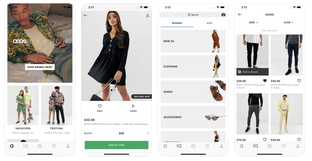
ASOS is a popular eCommerce platform for 20-somethings seeking the latest fashion trends. The platform features more than 850 brands and over 85,000 products, including clothing, shoes, and accessories.
ASOS has recognized that their primary target market of young professionals is highly active on mobile devices. As a result, ASOS has one of the best mobile eCommerce apps with minimalist UI and high-quality images.
Designers only use color when highlighting CTAs to funnel shoppers to the checkout as fast as possible. ASOS also offers Apple Pay (iOS) and Google Pay (Android) for express checkouts on mobile devices. The ASOS app is optimized for speed and efficiency to ensure customers have minimal pain points when completing a purchase.
9 Principles for Better Mobile App Design
Now that you’ve seen some excellent mobile app design examples, it’s time to explore 9 mobile app design principles to build user-friendly experiences for your customers.
- Make it Easy: Be aware of UX design psychology to avoid overloading people with content and information. Make sure directions are clear and break big tasks into digestible steps–as we saw with Weathsimple’s onboarding sequence.
- Make the navigation of your app predictable: Follow the “3-click rule,” where users can access any part of your application in three clicks or less. Also, make sure your mobile application experience mirrors the desktop and tablet versions. Wealthsimple, Evernote, Tumblr, and ASOS are all fantastic examples of this principle.
- Follow the basic laws of app navigation: Use globally accepted trends for mobile app navigation to minimize your product’s learning curve.
- Have a great, clear, and prioritized page design: Ensure your app has a clear content hierarchy with a layout that’s easy to digest. Label icons, features, and options clearly so users know exactly what tapping a link or button will do.
- Have brand image consistency: Keep your app’s UI on brand with consistent content and color palettes. Use the same navigational links for your mobile app as you do for the desktop and tablet versions.
- Minimize input and commitment from the user: Allow users to explore your mobile app without completing time-consuming onboarding forms. Offer things like Apple Pay/Google Pay, location tracking, credit card scanning, and other services to prefill forms and inputs. You can get app users to where they want to go much faster by reducing typing, thus creating an effortless user experience.
- Loading should be fast and well communicated: Communicate system tasks like loading and processing, so users know what’s happening at all times. Using percentage indicators or a countdown timer can further manage users’ expectations to reduce frustration.
- Optimize your app for mobile and diverse mobile users: Make sure content is easy to read on mobile devices and place links and CTAs apart to prevent users from accidentally clicking the wrong one.
- Do app design for humans: Mobile apps must meet accessibility guidelines so that users with visual impairments and disabilities can use your product too. UXPin’s built-in accessibility features include a contrast checker and color blindness simulator so designers can check their work to ensure it meets WCAG standards.
Improve Mobile App Design With UXPin
UXPin’s code-based design editor allows designers to build advanced mobile app prototypes to improve usability testing and reduce errors.
Use Iinteractions to create immersive mobile app user experiences. UXPin offers an extensive list of triggers for mobile apps, including tap/double-tap, swiping, scrolling, press hold, release hold, and focus, to name a few. Interactions can trigger all sorts of actions and animations to make your app interactive and engaging.
You can also create Javascript-like Conditional Interactions with “if-then” or “if-else” conditions, allowing you to create dynamic outcomes based on user and system triggers.
Unlike vector-based prototyping tools, UXPin’s code-based prototypes allow you to use Variables to capture user inputs and take actions based on the information they provide. For example, personalizing a welcome message after signup or confirming someone’s credit card details for a checkout sequence.
Set multiple States for elements and components, so your prototypes look and function like the final product. Designers can also use UXPin’s States to build complex components like drop-down menus, accordions, carousels, and more!
Ready to start building better mobile apps for your next design project? Sign up for a 14-day free trial to experience the power of UXPin’s code-based design tool.
The post 8 Mobile App Design Examples appeared first on Studio by UXPin.
from Studio by UXPin https://www.uxpin.com/studio/blog/mobile-app-design-examples/
