Terms, Types, and Taxonomy to Describe Visual Style
Design tokens have provided a visual foundation of many design systems since Salesforce pioneered the concept in 2014. I wrote an impassioned article on design tokens in 2016, and my energy on the topic continues to grow. As systems of visual style spread across a widening landscape of components, platforms and outputs, design tokens — and their names — are increasingly important.
Effective token names improve and sustain a team’s shared understanding of visual style through design, code, and other interdisciplinary handoffs. Terms matter. As we make things, we must be able to browse and search tools to quickly recognize and recall the purposeful decisions we’ve made. Not just in code and documentation, but in design tools too.
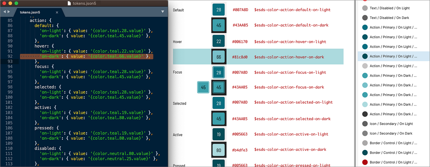
And naming is hard. Building token schema is a formative and occasionally passionate activity for a team. I’ve contributed to architecting tokens at Discovery Education, Morningstar, REI, USAC, NetApp, and ~10 other systems, each time unique yet informed by those that came before. Other public token collections inspire us too: Adobe, Shopify (as-is, emerging), Infor, Bloomberg, Sprout, Orbit and USDS among them.

As tokens become more sophisticated, naming patterns matter. Brandon Ferrua and Stephanie Rewis of Salesforce UX (at Clarity 2019) and Kaelig Deloumeau-Prigent of Shopify UX (at Design Systems Community Chapter Toronto, September 2020) exposed their models. Adobe Spectrum and Danny Bank’s Style Dictionary token tool document their models too.
Even simple design tokens exhibit naming patterns via levels.

For example, the $esds-color-neutral-42 token combines four levels — namespace (in this example, esds standing for “EightShapes Design System”), category, variant, and scale to map to #6B6B6B. Similarly, $esds-space-1-x orders namespace, category, and scale levels to represent 16px as another generic value.

Beyond generics, we need more levels to realize tokens’ promise as a way to centrally record and widely reuse purposeful visual decisions. The moderately complicated $esds-color-feedback-background-error and $esds-font-heading-size-1 purposefully represents values (#B90000 and 64px, respectively). More levels lead to more complicated yet specific tokens, such as how$esds-marquee-space-inset-2-x-media-query-s incorporates a component name and also includes two category / scale pairs.
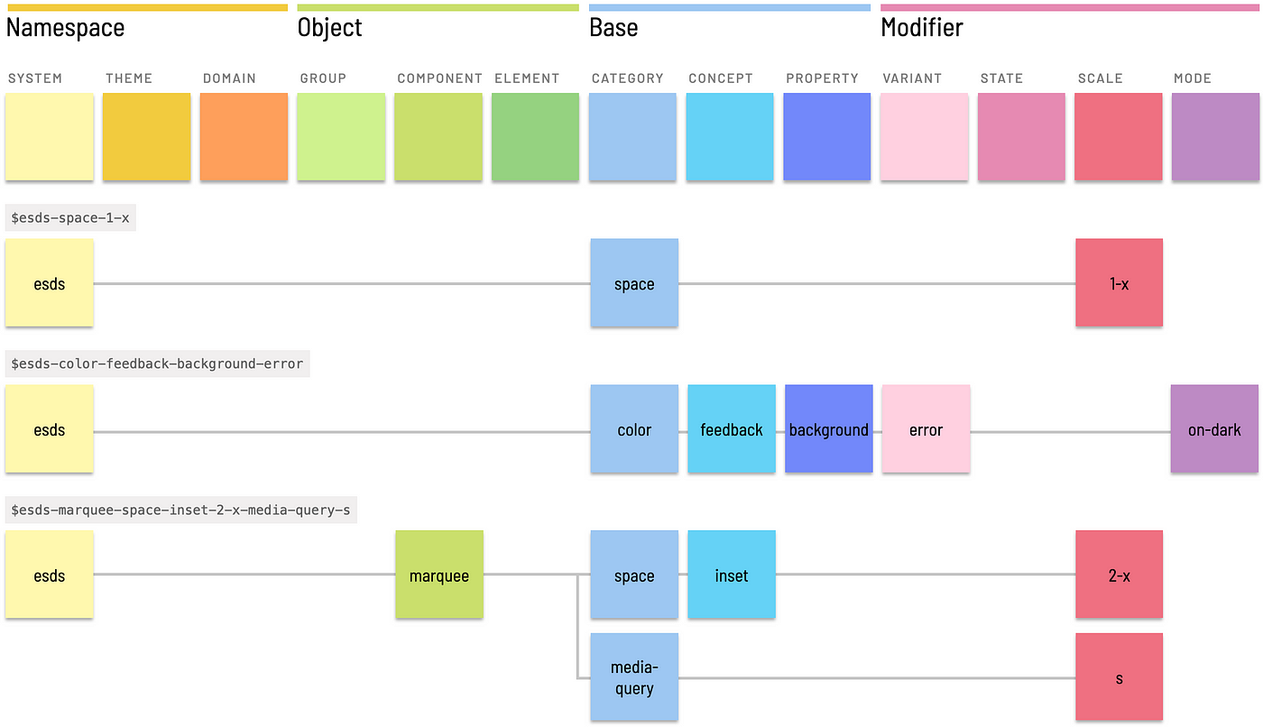
To be sufficiently descriptive, a tokenized language that incorporates both taxonomy and typology needs many levels. Enough levels, as it turns out, to organize them into groups:
- Base levels as a token’s backbone that combine category (for example,
color), concept (action) and property (size). - Modifier levels to refer to one or more of variant (
primary), state (hover), scale (100), and mode (on-dark). - Object levels to refer to a component (
button), element within a component (left-icon), or component group (forms). - Namespace levels combining any (or all, in extreme cases!) of system (
esds), theme (oceanor subbrand), or domain (retail).
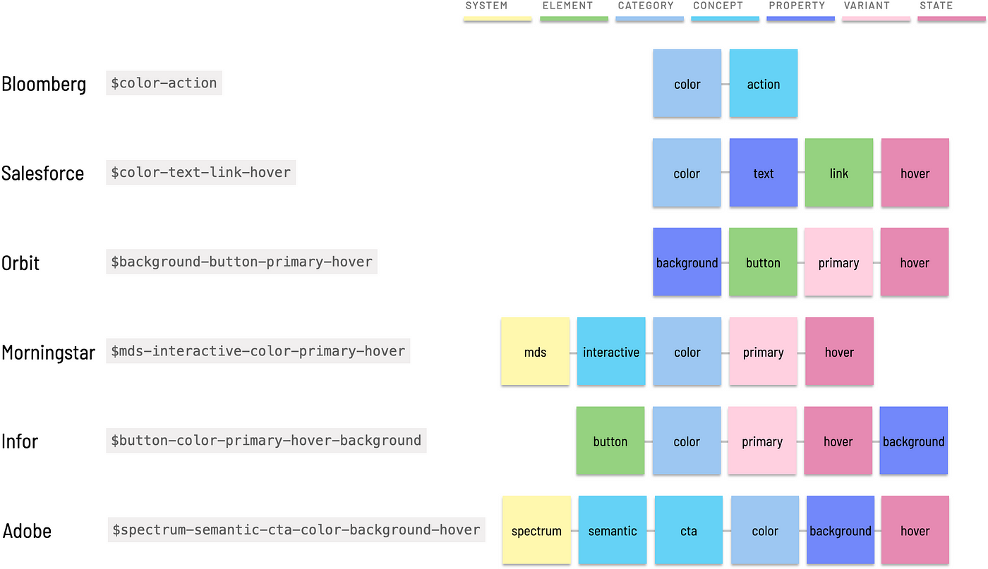
Different system applies levels differently. The diagram above depicts tokens from six different catalogs corresponding to my guess of their token that represents a primary action’s hovered color. I know, I know, I tried my best but may not have found the right token each time. Newsflash: that’s what users of tokens face. Nevertheless, the illustration exhibits varying depth, specificity, order, and intent found across systems. And patterns are evident.
This article expands on how to consider token naming with a solid base extended by modifiers, objects and namespaces. Along the way, principles and topics like completeness, order, and polyhierarchy deepen appreciation for the challenges that teams face as a token inventory grows.
Category and property offer a base point of departure for most token names. As a collection grows, a single category level proves insufficient as token subsets are organized as concepts.
Category
Tokens exist within a prototypical category like color, font, or space.

Categories span visual style concerns and may overlap at times. Other than quintessential color, different systems name categories in different ways. Common categories include:
colorfont(akatype,typography,text)space(akaunits,dimension,spacing)size(akasizing)elevation(akaz-index,layer,layering)breakpoints(akamedia-query,responsive)shadow(akadepth)touchtime(akaanimation,duration)
As shown in the list above, examples lead with a “preferred term” (like font) followed by an “aka” that highlights “variant terms” (like type and typography) used by other systems for the same purpose. These equivalent terms are provided for inspiration as your team forms a controlled vocabulary.
Principle: Avoid homonyms. Even top-level categories trigger difficult choices. type is a homonym, interpreted as many different things like shorthand for typography or as a category. The latter is troublesome for variable names! Similarly, some substitute text for typography, yet text is also synonym for content and a property too (more on that later). With typography being so darn long, teams often end up choosing font.
Property
A category can be paired with a relevant property to define a token, although the pair is insufficient to define a purposefully meaningful value.

Relevant color properties include text, background, border and fill, resulting in basic tokens that lack context, like:
$color-background: #FFFFFF
$color-text: #000000
$color-border: #888888
Common typography properties include size, weight, line-height, and letter-spacing, resulting in tokens like:
$font-weight: normal
$font-size: 14px
$font-line-height: 1.25
Category / property pairs are exceedingly general and not purposefully useful. We need concepts and modifiers.
Concept
Tokens can be grouped per category by adding one or more concepts.


For example, color can be grouped into concepts like:
feedback(akanotification,messaging,alert) with variants likesuccess,warning, anderror.action(akacta,interactive,interaction) to corral colors affording calls-to-action (links, buttons, …) and selected items (like tabs, navigation items, checkboxes, radio buttons, and filters).visualization(akadataviz,charting,charts). The financial Morningstar Design System even includes sub-concepts withinvisualizationforcorrelation,valuation,performance, andasset-allocationcolors and a default visualization colororder.commercecolors with variants forsale,clearance,inventory, andtimingurgency.
Concepts combine with variants to form tokens like $color-feedback-success, $color-action-primary, and $color-visualization-performance-positive.

Similarly, typography tokens are often grouped into concepts like heading (aka header, heading-levels, headline, display) andbody (aka text — there’s that homonym again!).
Special cases like eyebrow heading or lead (aka lede, deck, subheader, subhead) feel different from the headings (1, 2, 3, …) and body (s, m, l) concepts, respectively. Such a naming challenges hints at how variant and scale levels are also needed to achieve sufficiently purposeful names.
Principle: Homogeneity Within, Heterogeneity Between
At all levels, especially concept, strive for homogeneity within a class (like visualization) and heterogeneity between classes (such as visualization versus commerce). To keep concept counts low, you could fit sale and clearance into visualization. However, visualization is for charts whereas sale and clearance color objects within an e-commerce flow. Given the distinct meanings, divide them into separate concepts.
Tokens imbue purpose using modifying variant, state, scale, and mode levels. Modifiers are used independently or in concert, paired with levels like category, concept and property to form what can be an extensive stylistic typology of purposeful decisions.
Variant
A variant distinguishes alternative use cases. For example, a design language creates hierarchy and contrast by varying text color as:
primary(akadefault,base)secondary(akasubdued,subtle)tertiary(akanonessential)
Similarly, interfaces vary feedback color to alert the user of:
success(akaconfirmation,positive)error(akadanger,alert,critical)information(akainfo)warningnew
Tokens like $color-text-primary, $color-background-warning, and $color-fill-new combine a category / property pair with variant.

Principle: Flexibility or Specificity?
Tokens like $color-success combine category (color) and variant (success) as a parsimonious identifier applicable to many scenarios. This leaves interpretation to the user to apply $color-success to any of background, border or text.
Flexibility comes at the expense of specificity and — by extension — potentially precision of application. A success color may only be intended for text or background but not both. Even more, an object reflecting success may require distinct colors for text versus background versus border. In this case, including a property level in a token results in a more specific yet less flexibly applied $color-background-success or $color-text-success.
State
Tokens can specify properties based on interactive states, like:
defaulthover, when a pointer is positioned above an objectpress/active, between the time a user presses and releases an objectfocus, when an object is able to accept inputdisabled, when an object is not able to accept inputvisited, for alternative link display when already visitederror, when an object is in an error state
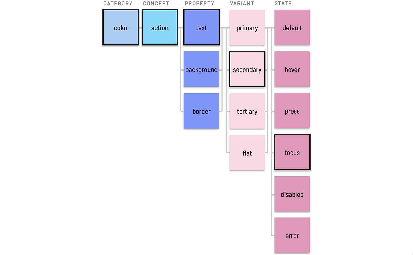
States often associate an object (button) or category (color), concept ( action)and property (text) tuple associated with a variant (secondary). This results in a fully formed token like $color-action-text-secondary-focus.
Scale
Tokens scale choices of varying size, space and other options applied to and between things. Common types of scale include:
- Enumerated values like heading levels’
1,2,3,4, and5. - Ordered values like Google Material color levels of
50,100, …,900. - Bounded scales like HSL’s 0 to 100 lightness value to vary shades of a tint, such as slate gray’s
slate-42,slate-90, andslate-95. - Proportion, often establishing a base
1-xand growing (2-x,4-x, …) and shrinking (half-x,quarter-x, …) relatively. - T-shirt sizes, starting with
small(variants:s),medium(variants:m,standard,base,default) andlarge(variant:l) and expanding toxl,xs, andxxxl. Pro tip: Size ≠ space, so consider using proportion instead of t-shirts for space despite what I said four years ago.
Scale manifests in both generic and purposeful tokens. For example, most systems define generic (aka, primitive) spacers like $esds-space-2-x for 32px and colors like $esds-color-neutral-42 for #6B6B6B that are aliased to purposeful uses of space and color. In this case, 2-x and 42 sit on proportion and lightness scales, respectively.
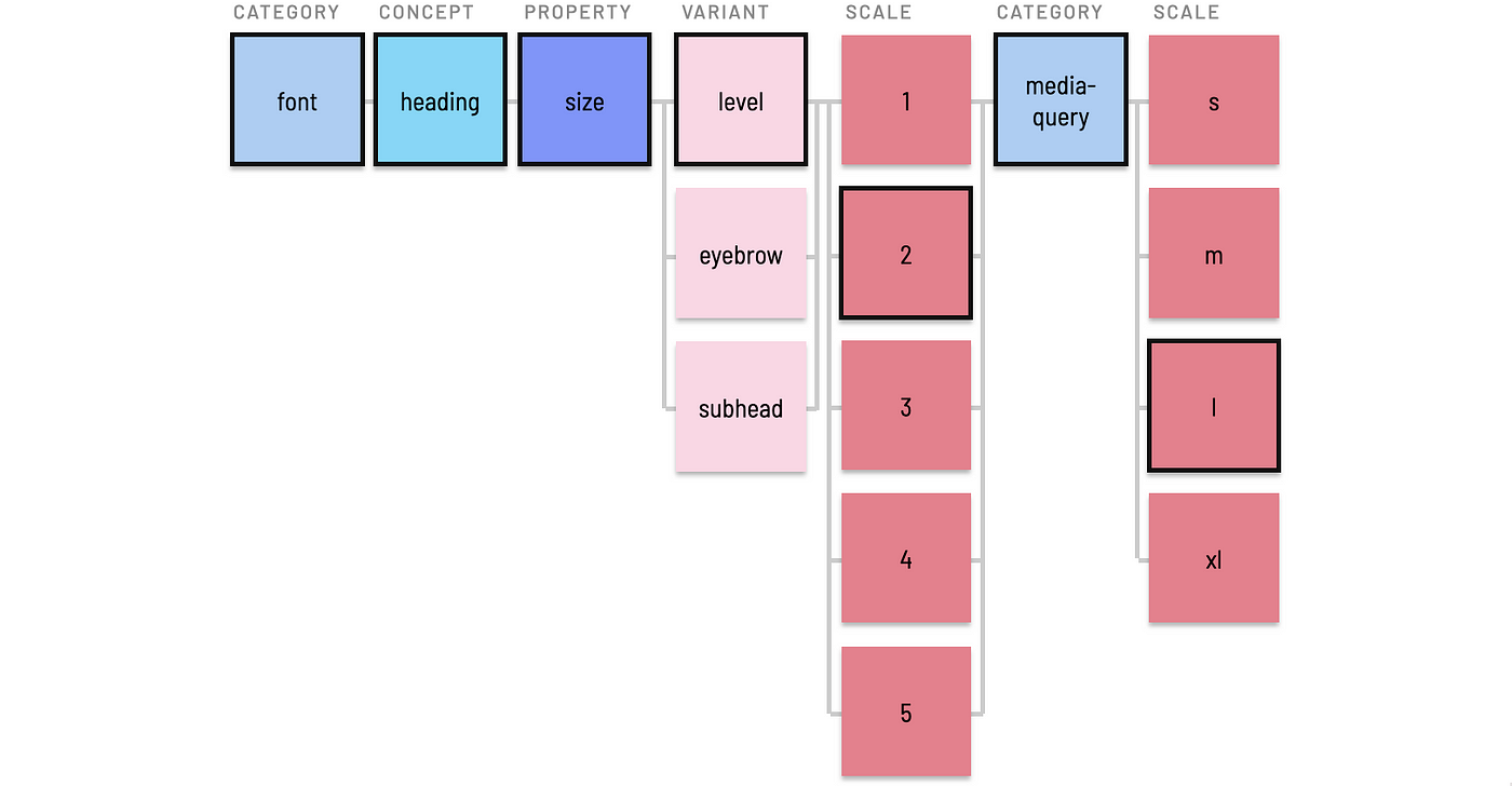
Purposeful token specify a scale (level-1) in the context of category (font), concept (heading) and property (size) for a token like $esds-font-size-heading-level-1 and $esds-font-size-body-small.

Less often, specificity requires chaining concept / scale pairs into one token. For example, a responsive typography system can combine heading as enumerated level (1, 2, 3, …) with media query breakpoints (media-query) as t-shirt sizes (m, l, …) to store a decision like 45px.
Mode (Usually, for “Light” and “Dark”)
Tokens can employ a mode modifier to distinguish values across two or more surface/background settings on which elements appear. This enables distinct light and dark modes, and expressive systems can also extend to additional brand-color mode (for EightShapes, that’d be orange surfaces on which many of our components rest).
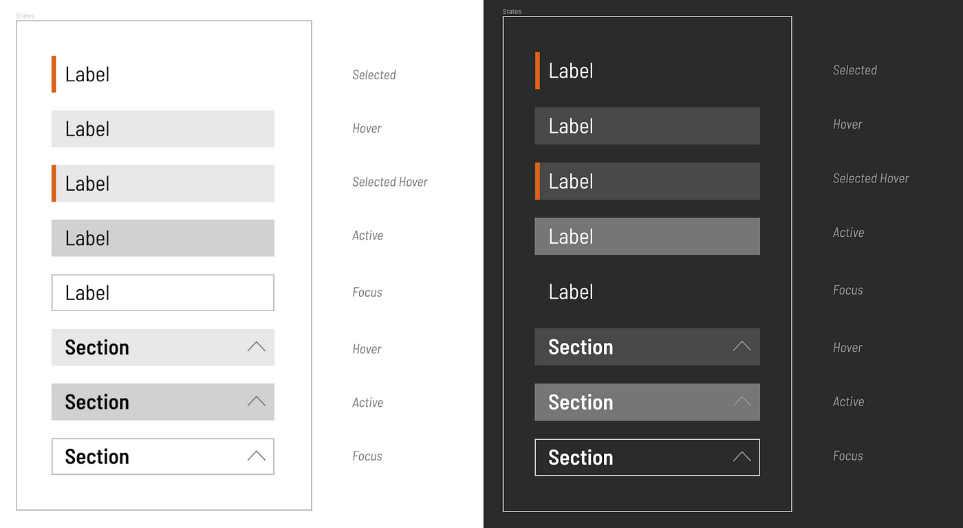
For example, you may need tokens for both $color-action-background-secondary-hover-on-light and $color-action-background-secondary-hover-on-dark to distinguish the hovered background color of items in vertical navigation, vertical filters, and horizontal tabs.
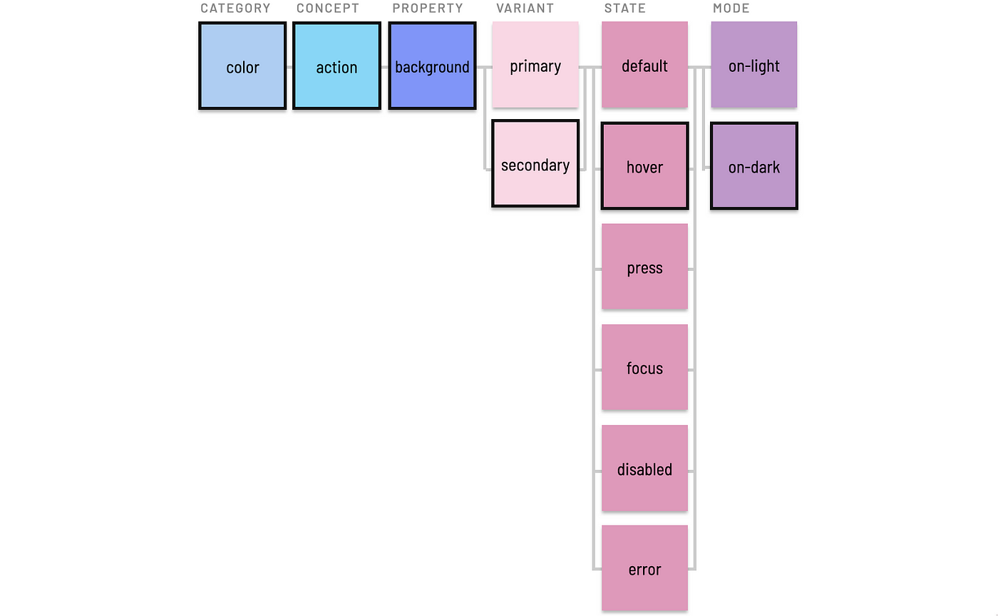
This increases the quantity of tokens, but in practice is limited to small subsets and is eased by aliasing simpler values (imagine, $color-accent-hover-on-dark) reusable across many predictable purposes.
Principle: Explicit versus Truncated Defaults
Tokens using mode could assume a default background (typically, “light” or white) and append an on-dark modifier only to “dark” alternatives. This avoids having to add on-light to many tokens where on-dark is irrelevant.
On the other hand, some systems rely upon parallel construction across sibling tokens to predictably iterate over a set, such that on-light, on-dark, and on-brand modified names will be expected and required.
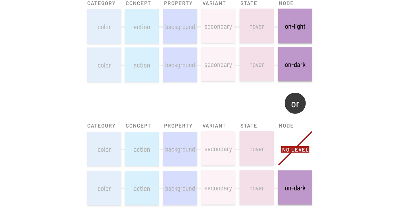
Principle: Include or Exclude Modifying Terms?
Tokens read more clearly by prepending terms like on- prior to a label like dark or light. However, on-dark takes more space and requires more effort to type. Such a choices tilts heavily towards personal preferences. Sure, I prefer on-light’s readability to conclude a token. However, my Cap Score opinion (check out Cap Watkin’s “Sliding Scale”) is weak about what the convention is yet strong that a convention exists.

Tokens promise reuse of purposeful decisions across a component catalog. Nevertheless, there are moments when tokens are reusable across only a few components or —woah! — just a single component. An object level classifies tokens specific to a component, element nested within a component, or a component group. This commonly arises when working on a cluster of components like forms.
For example, an input component uses many existing tokens, such as $esds-color-text-primary to color the textual value. On the other hand, a token collection may have nothing relevant to apply to an input’s border color and roundedness. Generic tokens like $esds-color-neutral-70 and explicit values like 4px will suffice, right?
Within a Component
The border color might be relevant elsewhere, but there’s no guarantee. In that cases, we’ll want to record that component-specific token ($esds-input-color-border) somewhere. But where?

A global token isn’t the place to start. Instead, record it in a place specific to that component, such as input’s design specs or the header of theinput.scss file. These locations are handy for recording decisions using conventional names and referencing past decisions when working on other components.

Nested Elements
Even atomic components like input can end up having nested elements like icons and links, also relevant candidates for reusing style.

Tokens specific to a nested element may include both component name and element name, much like the BEM CSS methodology. Element-specific tokens can also emerge in a local context like specs or input.scss, such as $esds-input-left-icon-color-fill, $esds-input-left-icon-size, and $esds-input-inline-link-color-text.

Component Groups
A component group like forms (aka ui-controls or form-controls) is relevant for tokens local to one component are also relevant for other related components that together form a meaningful group. For example, Select, Checkbox, and Radio Button may also use $esds-color-neutral-70 for borders.

Since the decision is relevant to many components (my rule of thumb is 3 or more), now is the time to:
- Add
$esds-forms-color-borderto global tokens. - Replace
$esds-input-color-borderwith$esds-forms-color-border. - Remove
$esds-input-color-borderfrominput.scss. - Apply
$esds-forms-color-borderto Select, Checkbox, and Radio.

Principle: Start Within, Then Promote Across Components
The emergent practice of identifying candidates for and promoting token ideas from local to global locations is a healthy way to add tokens gradually.
Principle: Don’t Globalize Decisions Prematurely
The shared need for a consistent form element border is predictable. Such elements are designed together, and these conventions emerge quickly.
Other cases aren’t as clear cut. Imagine working on tooltip, with popover and menu maybe to come later. A system might reuse shadows and notch roundedness, but can’t guarantee it. In this case, keep tooltip-specific tokens local to that component, and reference them later as work on popover or menu starts. This can avoid annoyingly subjective debates (“These are the notched-layers!”) and polluting a global namespace prematurely.
Small teams working in one namespace with limited collaborators need not worry about levels for namespace. However, given that tokens exist to propagate style across many scopes and platforms, prepending namespace(s) to scope variables to a system, theme or domain can be essential.
System Name
Many systems prepend a namespace level using a:
- System name, such as
comet-ororbit-. Short system names, such as five characters or less, typically work well. Otherwise, settle for a… - System acronym for long names, such as
slds-(for Salesforce Lightning Design System) ormds-(for Morningstar Design System).
As a result, common tokens namespaced to esds appear to developers as $esds-color-text-primary and $esds-font-family-serif, distinct from and easy to trace relative to the variables a team creates.
Theme
Systems may often offer a theme that shifts color, typography and other styles across a component catalog. For example, an organization like Marriott may defining themes for JW Marriott, Renaissance, W, Courtyard, and other hotels. A theme’s primary purpose would be to flow visual decisions that extend and often override existing tokens. For Marriott’s Courtyard, that may be flowing a branded action color (#a66914) across components like buttons, checkboxes, and selected tab highlights.

Conventions for naming and flowing tokens in themed architectures is a considerably complicated topic beyond the scope of this article. Different teams set up tools, compilation, and naming structures in different and often very sophisticated ways. However, a few “themes about theming” are posited here to clarify the intent of a theme level.
For example, consider an animation app (supported by, say, the $aads “Animation App Design System”) may offer color themes such as ocean, sands, mountain, and sunset. Each theme may need to vary similar but distinct design tokens in both generalized and specific contexts.
// General tokens to alias thematic colors to many contexts
$aads-ocean-color-primary
$aads-sands-color-primary
$aads-sunset-color-secondary// Specific token overrides and extensions
$aads-ocean-color-heading-text-1
$aads-sands-color-heading-text-1
$aads-mountain-color-alert-background-success
One way to record token decisions is to append theme (ocean) to a system namespace (like aads), resulting in a narrower namespace of $aads-ocean. This namespace provides system authors a place to map theme-specific values that override and at times extend default token values. For example, when compiling visual decisions for the ocean theme, the following mappings could be relevant:
$aads-color-text-primary
 = $aads-ocean-color-primary;
$aads-color-forms-text-metadata
 = $aads-ocean-color-primary;
$aads-color-background-secondary-on-dark
 = $aads-ocean-color-primary;
Principle: Theme ≠ Mode. A theme may eventually require on-light, on-dark color applications. Marriott courtyard components may very well require light and dark modes just as much as Marriott renaissance components require. As a result, a theme is orthogonal to a color mode in systems using both concepts.
Domain
While I’ve not yet observed this in practice, I anticipate systems will scale to support ecosystems of tokens for design system tiers. A domain (aka business unit) level offers namespaces for a group to create, isolate, and distribute a set of tokens on their own beyond the set coming from the system’s core.

For example, a consumer group building marquees, card tile systems, and other promotional components could result in a wide collection of new tokens. This could result in tokens in a consumer namespace like:
$esds-consumer-color-marquee-text-primary
$esds-consumer-color-promo-clearance
$esds-consumer-font-family-marquee
$esds-consumer-space-tiles-inset-2-x
These local decisions may need to be applied across multiple themes (various consumer product lines) or color modes (consumer’s light and dark mode).
Every organization is different, so there’s no conventional names to start from. One bank may divide into credit-card, bank and loan domains, whereas another into sales and servicing groups. An internet company may contrast consumer versus business. Teams may want to distinguish public vs partner vs internal applications. Looking in from the outside, I could imagine a group like Shopify Retail benefiting from “retail” tokens extending what they got from the core Polaris team, and that some of those may be useful to other teams or even promote into a core.
Regardless of level, topics of completeness, order, and polyhierarchy recur in token naming discussions.
Completeness
No single token includes all potential levels. Some levels — domain, theme, element — are rarely needed. Other levels — a quantitative scale versus qualitative variant — tend to be mutually exclusive. Avoid dogmatically including all levels possible or duplicating token-tuples redundantly. Instead, include only the levels needed to sufficiently describe and distinguish purposeful intent.
// Good
$esds-shape-tile-corner-radius
$esds-shape-tile-shadow-offset// Bad, redundant
$esds-shape-tile-corner-radius-default-on-light
$esds-shape-tile-corner-radius-default-on-dark
$esds-shape-tile-shadow-offset-default-on-light
$esds-shape-tile-shadow-offset-default-on-dark
Order
As evidenced in reviewing tokens across my projects and other public collections, there’s no prevailing token level order. As such, here are some patterns I’ve sensed hold steady:
- Base levels (category, property, concept) are a backbone in the middle.
- Levels within Base vary based on preferences for hierarchical strictness (
color-interactive-background), readability (interactive-background-color), or keeping levels like category and property paired together (color-background-interactive). - Namespaces (system, theme, domain) are prepended first.
- Modifiers (variant, state, scale, mode) tend to be appended last.
- Object levels (component group, component, and nested element) are subordinate to namespaces and establish context that can contain and therefore precede base and modifier levels.
- Order within modifiers isn’t consistent, although mode is often last (given its framing of “on” and use limited to only color and, even then, only when there’s a distinction).
While level order presented here is an option, it’s not the only option. Your system’s level order depends on what levels you use, what your system needs, and the discriminating tastes of each team member.
Polyhierarchy
Concept, category, variant and other levels can overlap and compete. For example, an “error red” can be both concept variant color-feedback-error and object variant of ui-controls-color-text-error (included in packages for Input, Checkbox, Select, and other form controls). This forces us to decide:
At what level(s) do I store this purposeful decision?
Is it ok to store the same decision in two different locations?
If purpose of two different choices is nearly identical, should it be 1 or 2 tokens?
Both color-feedback and ui-controls-color-text concepts have other variants (warning, success, info and label, value, and helper-text, respectively) for which error completes a set. Even if the actual red value is the same, I value the completeness of both sets. Therefore, I would consider aliasing one (the object variant) to the other (the concept variant).
$ui-controls-color-text-error = $color-feedback-error
 (= $color-red-36)
 (= #B90000)
This also hedges against the possibility that the ui-controls-color-text-error red could be adjusted later without impacting other uses of color-feedback-error, tracing a change to only those values fitting that purpose.
Thinking across so many possible token levels can feel daunting (as can a blog post that’s this long). As you take a look at your tokens next time, be buoyed by the notion that you have a range of choices to make as you craft a vocabulary for your team to share and grow together. Happy naming!
from Medium https://medium.com/eightshapes-llc/naming-tokens-in-design-systems-9e86c7444676
